
Van Gogh painted two starry nights, and people mix them up constantly. They are different paintings, made a year apart, in different towns, in different states of mind. If you are choosing one for a wall, the difference matters more than the confusion suggests.
The famous one
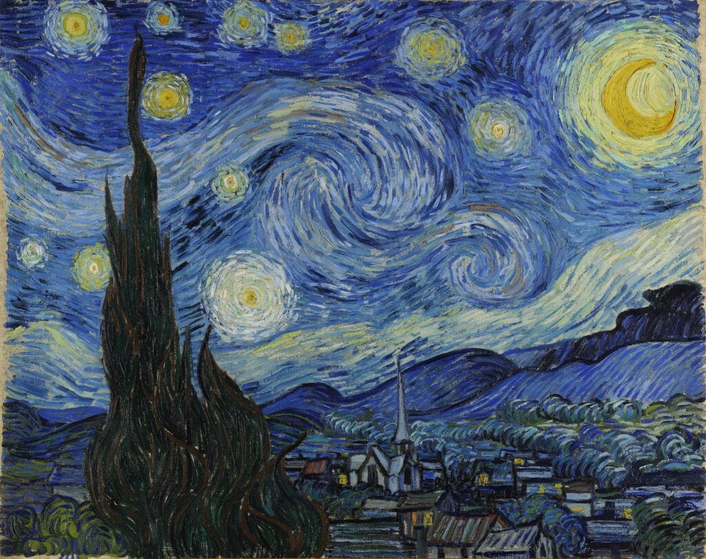
The Starry Night was painted in June 1889 at the asylum at Saint-Rémy-de-Provence, from a window, with the village added from imagination. It is the one with the black cypress climbing the left edge and the sky rolling in spirals.
It is not a calm picture. The sky is in motion, the cypress is a dark vertical tearing through it, and the village below is asleep and indifferent. People buy it as a soothing image and get something considerably stranger.
The quieter one
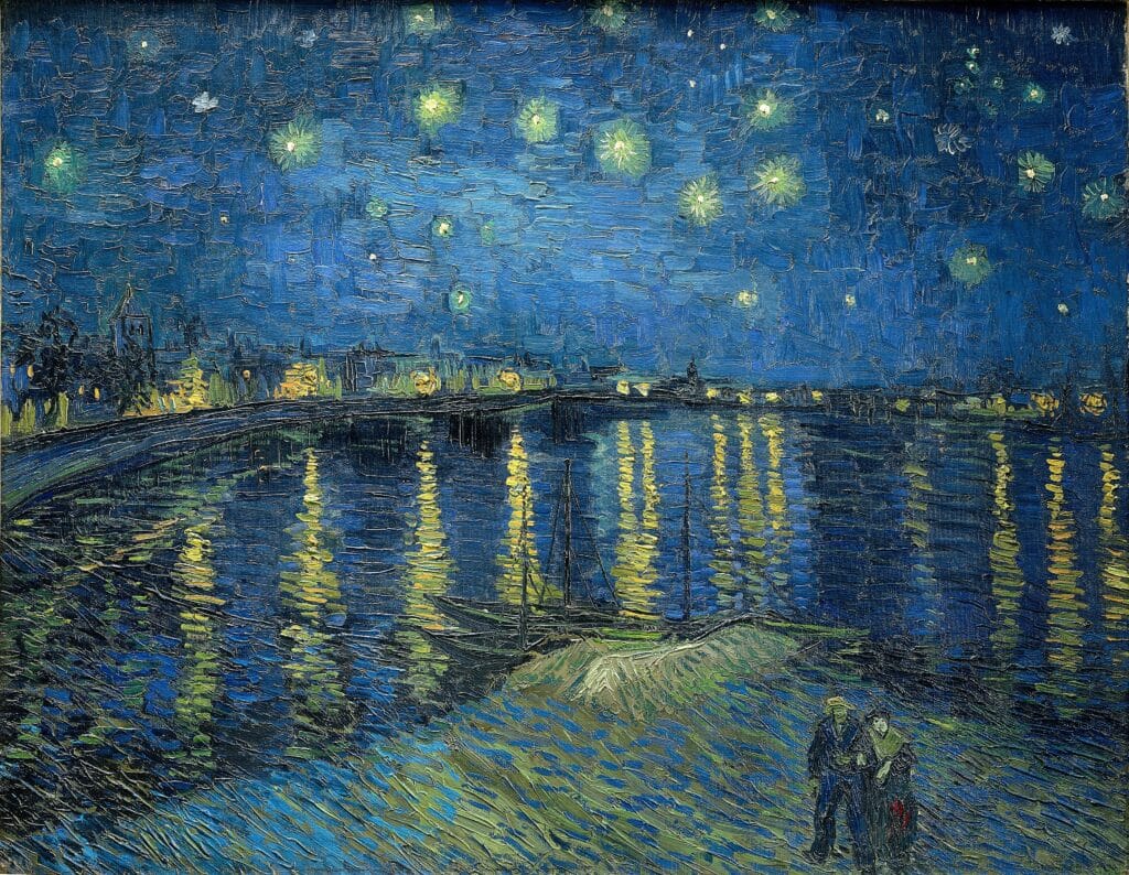
Starry Night Over the Rhone came first, painted in Arles in September 1888, on the bank of the river at night. Gaslights along the far shore lay their reflections down into the water. Two figures walk at the front edge.
Everything the later painting does with turbulence, this one does with stillness. The stars are points, not whirlpools. The water holds the light rather than throwing it about. There are people in it.
What happened between them
The year between the two paintings was the worst of his life. The Rhône picture was made in Arles in autumn 1888, during the months when he was expecting Gauguin to arrive and had persuaded himself that a community of painters might be built in the south. He was working hard and hopeful.
By June 1889 he was a voluntary patient at the asylum at Saint-Rémy, painting from a barred window. The Starry Night was made there, from that window, with the village invented and added because the view did not contain one.
Neither painting is an illustration of his state of mind — that reading flattens both of them into biography. But the difference in how the two skies behave is not nothing, and once you have seen one as a night observed and the other as a night imagined, it is hard to unsee.
How to tell them apart at a glance
Three reliable markers.
The cypress. Only the Saint-Rémy painting has the dark tree climbing the left edge. If there is a black flame-shaped tree in the foreground, it is the famous one.
The water. Only the Arles painting has a river with reflections running down towards you. The famous one has no water at all.
The people. The Rhône picture has two figures walking at the front. The Saint-Rémy picture has no one — the village below is shuttered and empty.
The blue in both
Both paintings lean on the same pigment family, and it is worth knowing that Prussian blue — the synthetic colour discovered in Berlin in the early eighteenth century — appears in his palette in this period. It is the same pigment that gave Hokusai his wave.
That matters for a reproduction. The blues in these two pictures are doing structural work, not decorative work. Push them warmer and the Rhône loses its cold; push them lighter and Saint-Rémy stops being a night.
Which one for your wall
Both are 46 by 36 inches here and both are US$630, so the decision is not about size or money. It is about what the room is for.
Take the Saint-Rémy one if the wall can carry something restless — a stairwell, a study, a room with hard furniture and space around it. It will dominate whatever is near it, which is either what you want or exactly what you do not.
Take the Rhône one for a bedroom, a dining room, anywhere people sit still. It is a night painting that is actually restful, and its blues sit more easily beside furniture. It is also the less obvious choice, which some people count as a point in its favour.
If you want both
They work together, and this is one of the few cases where buying two of the same artist is not a mistake. They are the same subject a year apart, which gives a pair a reason to exist beyond matching colours.
Hang them side by side with roughly six inches between, aligned on their horizontal centres rather than their tops. Both are 46 by 36 inches, so a pair needs about eight feet of wall. That is a long wall — a dining room, a landing, a large bedroom.
Do not hang them one above the other. Landscape-format works stacked vertically almost always look like a mistake, because the eye reads the pair as one tall block that is the wrong shape.
A note on what you are actually buying
Both of these are among the most reproduced images in the world, which means most of what is sold under their names is poor. The usual failures are a blue that has gone purple, a yellow that has gone acid, and a crop that has quietly trimmed the edges to fit a standard frame size.
Ours are printed at the proportions of the originals, which is why the dimensions are 46 by 36 rather than a round number. Nothing is cropped to fit.
One practical note
Both are landscape format at 46 inches wide. That needs roughly five feet of clear wall to look deliberate rather than crammed. Over a sofa it works well; in a narrow hallway it will not.
If neither suits, the same restlessness in a smaller frame is in Cafe Terrace at Night, and the calmest Van Gogh we stock is The Bedroom. All of them sit in Life & Places and Landscape & Seascape.