
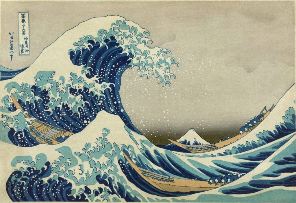
The most recognisable image in Japanese art depends on a German industrial chemical. Without it, The Great Wave off Kanagawa would not look like itself.
What blue used to be
Before the 1820s, blue in Japanese woodblock prints came from indigo, made from plant leaves. Indigo has a problem: it fades. Leave a print in daylight and the blue drifts towards grey, which is why many surviving prints from earlier decades look washed out in a way the printer never intended.
That is the constraint Hokusai was working under, and it shaped what a print could be. You could not build an image around a deep, permanent blue, because there was no such thing.
Then Prussian blue arrived
Prussian blue was discovered by accident in Berlin in the early 1700s — the first modern synthetic pigment. It is intensely dark, close to black at full strength, and it holds its colour.
It reached Japan through Dutch traders at Nagasaki and became available in quantity in the 1820s. The Japanese called it bero ai, a corruption of Berliner Blau — Berlin indigo.
Hokusai was in his seventies. He built the Thirty-Six Views of Mount Fuji around the new pigment, and the publisher advertised the blue as a selling point. The Great Wave, published around 1831, is one of the first Japanese prints designed entirely for a colour that had only just become obtainable.
An accident in a Berlin laboratory
Prussian blue was not invented so much as stumbled into. A colour maker in Berlin in the early 1700s, trying to produce a red, used a contaminated ingredient and got an intense dark blue instead.
It was the first modern synthetic pigment, and it changed what was affordable. Until then a strong permanent blue meant ultramarine, ground from lapis lazuli, which cost more than gold and was reserved for the robes of saints. Prussian blue could be made in a workshop.
It spread across Europe within decades, and then travelled east — reaching China through trade routes and Japan through the Dutch post at Nagasaki.
Why the publisher advertised the colour
This is the detail that says most about the moment. Hokusai’s publisher did not treat the new pigment as a technical footnote. He advertised it. The blue was the selling point, and buyers wanted the prints partly because the colour was foreign and new.
It is a useful corrective to how we tend to think about the Great Wave now — as a timeless emblem of Japan. At the moment it was made it was closer to the opposite: a print built around an imported industrial chemical, using European ideas about perspective, sold partly on novelty.
What the wave is doing to the boats
There are three boats in the picture, and most people do not notice them at first. They are oshiokuri-bune, fast boats used to carry fresh fish to market, and the men in them are lying flat along the hulls.
They are not panicking. They are doing the correct thing in heavy water, which is to get low and hold on. Once you have seen that, the print stops being about a wave and becomes about the people underneath it — small, competent, and entirely at the mercy of the sea.
Mount Fuji sits in the trough, far away and snow-capped, and at first glance reads as another wave crest. That ambiguity is deliberate. The series is called Thirty-Six Views of Mount Fuji; in the most famous of them, the mountain is almost hidden.
Why this matters for a reproduction
Because the whole picture is a decision about one colour. The wave reads as menacing because the blue is dark enough to sit almost black against bare paper. Shift that blue warmer or lighter and the image loses its weight — it becomes decorative rather than dangerous.
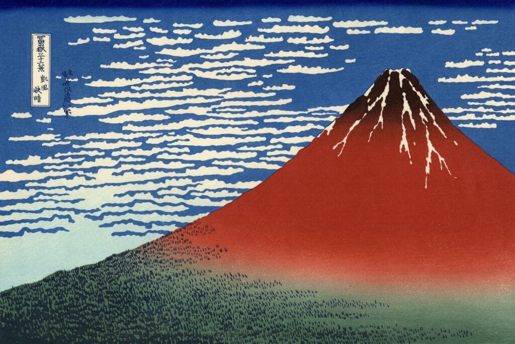
This is the real argument for caring about colour fidelity in a print. It is not connoisseurship. On Red Fuji (Southern Wind Clear Morning), the same pigment carries a clear morning sky instead of a wall of water, and the same sensitivity applies.
It is a print, not a painting
Worth stating plainly, because it changes what a reproduction is doing. The Great Wave was never a unique object. It is a woodblock print, made in an edition, from carved cherry blocks — one block per colour, printed in sequence onto paper by hand.
Thousands were produced. It was a commercial product sold cheaply to ordinary people, which is exactly what Ravi Varma would set out to do in India a few decades later.
So a good reproduction of the Great Wave is not a copy of a precious singular thing. It is the latest in a long line of impressions of an image that was always meant to be multiplied. That is a more comfortable position than reproducing an oil painting, and we think it is worth being clear about.
Hanging it
At 36 by 25 inches it is one of the smaller works in the catalogue — deliberately, because the original print is roughly 25 by 37 centimetres and we scale to the proportions rather than inflating everything to fill a wall.
That size suits a study, a hallway, a wall beside a door, or a group. Above a large sofa it will be lost; the 54-inch Red Fuji from the same series is the better choice there.
The blue is dark enough to hold its own against a dark wall, which is unusual. Most reproductions need light behind them. This one does not.
One last thing about the wave
It is probably not a tsunami. The more likely reading is a rogue wave in open sea, of the kind sailors in Sagami Bay had good reason to fear. The boats are not being surprised by a freak geological event; they are doing their job in bad water.
Both Hokusai prints sit in Landscape & Seascape.