How to Master Color Theory: A Practical Guide for Aspiring Artists
Introduction
Color isn’t just about beauty—it’s about meaning, emotion, and communication. For artists, mastering color theory is like learning a new language: one that speaks directly to the viewer’s senses. Whether you’re working with oils, acrylics, digital media, or watercolors, a strong grasp of color theory can elevate your work from good to unforgettable.
In this guide, we’ll walk you through the core principles of color theory, explain how they apply to your daily practice, and provide tips to help you experiment with confidence. You don’t need a formal art education to start thinking like a colorist—you just need curiosity, some basic tools, and the willingness to play.
What Is Color Theory?
At its heart, color theory is the science and art of using color effectively. It combines practical knowledge (how to mix and match colors) with psychological insight (how colors affect mood and perception). It helps artists understand:
- Which colors work well together
- How to create depth and contrast
- How to evoke emotion through palettes
- How to avoid muddiness or imbalance
Why Color Theory Matters in Art
Color choices can change the entire message of a painting. Imagine Van Gogh’s “Starry Night” without its swirling blue hues or Matisse’s bold fauvist contrasts. Good color use doesn’t just support your composition—it defines it.
A working understanding of color theory allows you to:
- Make your subjects pop off the canvas
- Guide the viewer’s eye across your work
- Create harmonious or deliberately discordant moods
- Enhance storytelling and symbolism
Whether you’re an abstract painter or a landscape enthusiast, your use of color plays a central role in your artistic voice.
The Basics: The Color Wheel
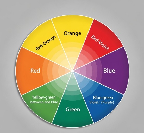
The modern color wheel is based on three primary colors:
- Red
- Blue
- Yellow
From these, we get the secondary colors:
- Green (blue + yellow)
- Orange (red + yellow)
- Purple (red + blue)
And by mixing primary with secondary colors, we get tertiary colors, like red-orange or blue-green.
The relationships between these colors are the foundation of most palettes you’ll use.
Warm vs. Cool Colors
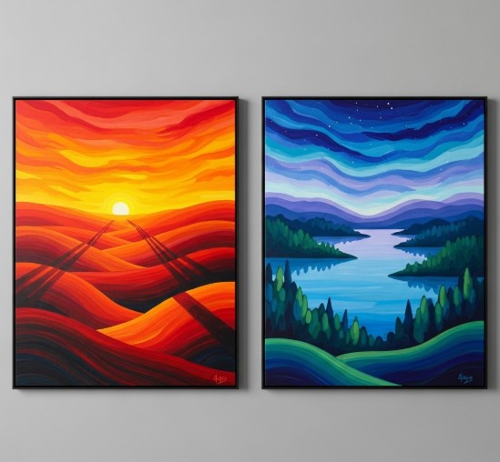
- Warm colors (red, orange, yellow) evoke heat, passion, energy, and urgency.
- Cool colors (blue, green, violet) evoke calmness, distance, and tranquility.
🔥 Use warm colors to draw attention or convey intensity
❄️ Use cool colors to suggest background, shadow, or stillness
Understanding Color Harmony
Color harmony refers to combinations that are pleasing to the eye. Here are the most commonly used harmonious schemes:
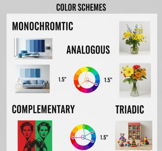
1. Complementary Colors
Colors directly opposite each other on the color wheel (e.g., red and green, blue and orange).
- Creates strong contrast and visual tension
- Great for dynamic compositions
2. Analogous Colors
Colors that sit next to each other on the color wheel (e.g., blue, blue-green, and green).
- Creates a calming and cohesive effect
- Ideal for landscapes or unified compositions
3. Triadic Colors
Three colors equally spaced on the wheel (e.g., red, yellow, and blue).
- Offers vibrancy and balance
- Use with varying saturation to avoid visual overload
4. Split-Complementary
A base color and the two colors adjacent to its complement (e.g., blue + red-orange + yellow-orange).
- Provides contrast without being too harsh
The Role of Value, Saturation, and Hue
- Hue: The base color (red, blue, etc.)
- Value: How light or dark a color is
- Saturation: How pure or muted a color is
Being able to control value is essential for creating depth. Adjusting saturation allows you to shift between bold and subtle moods.
A monochromatic painting can still be compelling—if your use of value is strong.
Color Psychology: How Color Affects Emotion
While interpretations vary across cultures, colors tend to have common emotional associations:
| Color | Emotion/Meaning |
|---|---|
| Red | Passion, urgency, danger |
| Blue | Calm, trust, sadness |
| Yellow | Optimism, energy, attention |
| Green | Growth, peace, nature |
| Purple | Mystery, luxury, spirituality |
| Black | Elegance, power, grief |
| White | Purity, clarity, simplicity |
Use this emotional vocabulary in your work intentionally. You’re not just painting with pigment—you’re painting with feeling.
Practical Exercises to Master Color Theory
Here are five beginner-friendly exercises to strengthen your understanding of color:
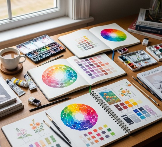
1. Make Your Own Color Wheel
Mix primary colors by hand to create a full wheel of secondary and tertiary hues.
2. Create a Limited Palette Painting
Choose 2-3 colors and paint an entire scene, exploring how to mix new tones.
3. Value Study in Grayscale
Convert a color image into black-and-white and try replicating it with just shades of gray.
4. Complementary Contrast Practice
Paint a still life using only one pair of complementary colors and their tints/tones.
5. Color Emotion Challenge
Choose an emotion (e.g., joy, anger, serenity) and create an abstract work that expresses it using only color.
Color Mixing Tips
- Always test before applying: Colors shift as they dry (especially acrylics and watercolors).
- Use a palette knife: For clean mixes without brush contamination.
- Mix darks with complementary colors: Instead of using black, mix red + green or blue + orange for rich shadows.
- Keep a color journal: Track your experiments and mixes for future reference.
Digital vs. Traditional Color Work
For digital artists:
- Use RGB (Red, Green, Blue) and HSB (Hue, Saturation, Brightness) models
- Leverage tools like Adobe Color Wheel (color.adobe.com) for palette exploration
- Create swatch libraries for consistent work
For traditional artists:
- Understand pigments (some are more opaque, some stain)
- Limit your palette for harmony
- Explore layering and glazing techniques
Studying the Masters
One of the best ways to understand color is to study those who’ve mastered it. Analyze the work of:
- Claude Monet – Impressionist color harmony
- Henri Matisse – Bold, emotional palettes
- Mark Rothko – Mood through minimalism
- Georgia O’Keeffe – Color-driven nature abstraction
You’ll begin to see how their choices support their messages—and you’ll develop your own voice in response.
Build Your Personal Color Palette
As you grow, you’ll notice recurring colors in your work. This is your visual identity forming. Take time to:
- Reflect on your emotional connections to color
- Create mood boards or swatch collections
- Name and organize your favorite combinations
Over time, your palette will become as recognizable as your signature.
Common Mistakes to Avoid
- Overmixing: Leads to muddy, dull colors
- Too much contrast: Jarring or distracting unless used with intention
- No color hierarchy: Everything competes for attention
- Neglecting value: Even vibrant colors need light/dark balance
💡 Color is powerful—but it must be controlled. Mastery comes from repetition and awareness.
Bringing It All Together in Your Practice
Color theory is not just something you read about—it’s something you test, break, and rediscover through painting. Use it as a foundation, but always trust your instincts. The most powerful color choices often defy the rules but are backed by deep understanding.
Explore Colorful Canvas Art on ISKUSS
Looking for inspiration or examples of bold, harmonious palettes?
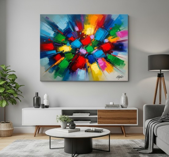
Visit ISKUSS, where you’ll find curated canvas art across styles—from serene landscapes to vivid abstract forms. Discover traditional and contemporary artists from around the world, all united by their unique use of color.
Additional Resources
- Adobe Color Wheel – Explore and create custom palettes
- ISKUSS – Canvas prints with artistic depth and vibrant color
- Books: Interaction of Color by Josef Albers, Color and Light by James Gurney
- YouTube Channels: Proko, Ten Hundred, The Art of Aaron Blaise
Final Thoughts
Mastering color theory isn’t about memorizing charts—it’s about developing an intuitive, emotional relationship with color. Use this guide as a starting point, but make time to experiment, reflect, and create fearlessly. Color is one of the most direct ways to connect with your audience—and your own creativity.
Start mixing. Start observing. Start building your own chromatic universe—one stroke at a time.
